
May - Aug.2018
Mojoy is an easy-to-use remote residential cleaning plan tool that combines innovation and today's IoT(Internet of Things) technology and strives to simplify the residential cleaning experience using Augmented Reality. It helps you spend less time customizing personal residential cleaning tasks to make the cleaning process more accessible.
Alright then. Let’s get started ! 😄
It is an individual project that I did in the 2018 Spring. The duration of this project was 14 weeks. I focused on User Research, User-centered Design, UX/UI design, Prototyping, and Augmented Reality in this project.
My goal was to enhance the residential cleaning plan experience by providing house owners with a digital solution to simplify the cleaning plan process and make it easier.
1.The core value proposition of the offering was making residential cleaning easy.
2.I want to improve the inconveniences that people while set their cleaning plan. I try to integrate Immersive experience into customer's residential cleaning journeys to set people free from hectic housekeeping chores and allow people to enjoy their leisure time.
3.Uncover issues and propose design solutions.
I want to make the login as easy as possible. Get into the app just scanning your face, and the system will recognize your identity and connect with your smart home system.

To get started, choose the service you need.
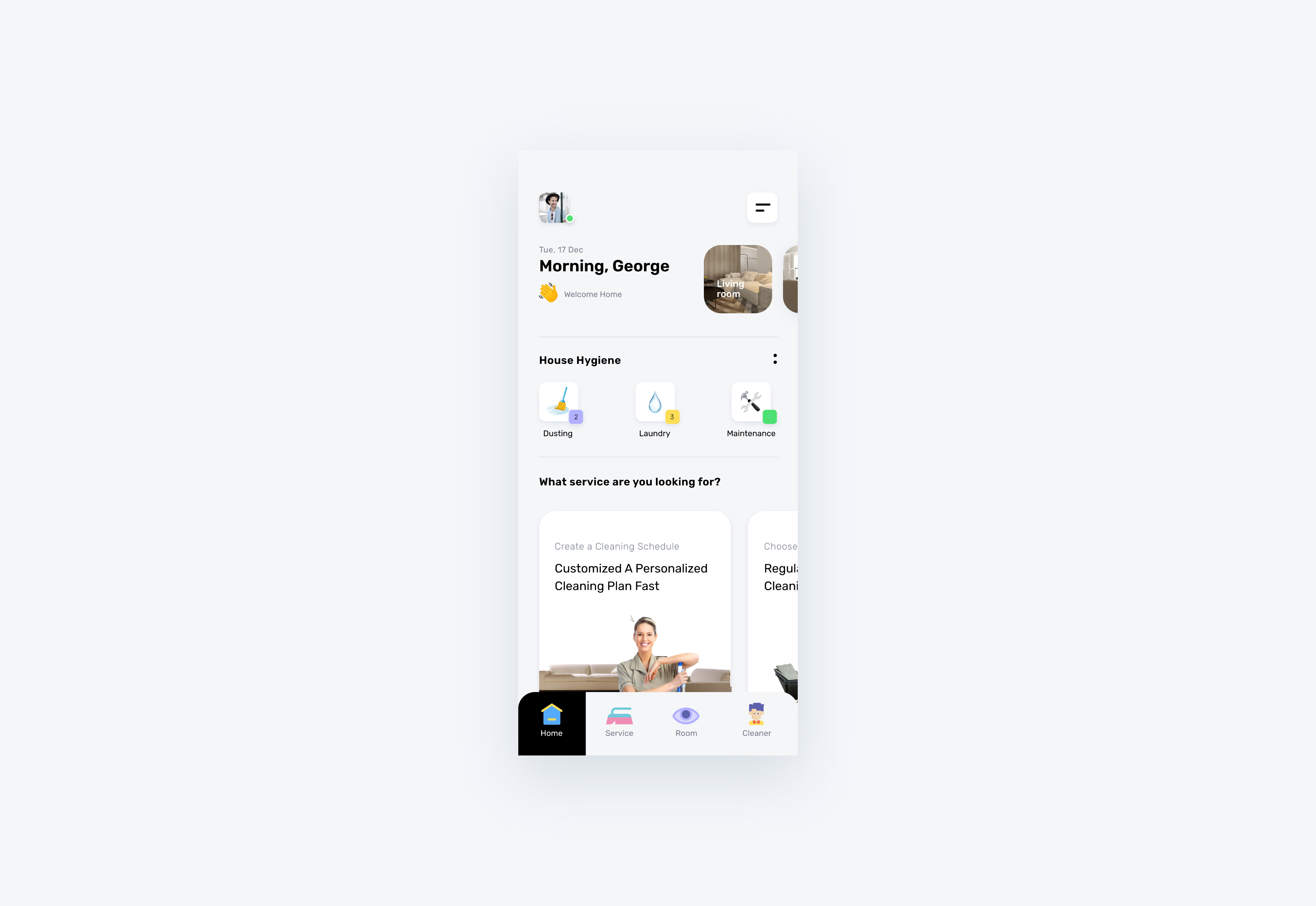
In Mojoy, it's much easier for you to quickly view the room in real-time and customize personal cleaning tasks according to your requirement with the augmented reality. Scroll down and view each room. You can instantly create a virtual cleaning plan for a cleaner by a tap on the "Add" button.

When you're done setting the cleaning task, a matching algorithm will recognize your user patterns and recommend the most match cleaner for you by leveraging past behavior patterns.

After defining a breakpoint for each format, a AR based version was built for smart glasses devices.
I start with being aware of user's needs and gaining insight from online research. I realized sketches could help me getting inspiration for the product.
Now I will talk about my research based on both the user and market sides while explaining my reasoning along the way.

A small part of my research journal
Americans spend about 6 hours a week on average cleaning their homes
+ 69% of Americans feel like the time spent on housework causes them to miss quality time with their family.
+ 31% of Americans wonder if they are cleaning correctly.
Customers are hesitant to
spend time on planning their housework.
I want to understand customer's pains and motivations. So I conducted small surveys and obtained data from research that provided me insights to determine the pain points when they use housekeeping service.


A Glance of user's Needs
I was conducted three user interviews to better understand our participants's choices.After interviewing users i found that out of the people i talked to there were 2 main catergories as below:
- NATALIE
I am not good with cleaning and too lazy to do housework. I clean sometimes, but the house always seems like a mess.
- JOSH
I don’t like cleaning because of the amount of time it takes to do it. I don’t want to lose my entire day off on the weekend to play cleaning lady.
Augmented Reality can enhance the consumer experience. AR visualization tool allowing you to view your room in your surroundings, my hypothesis is that by making this feature visible.

Based on previous findings, three distinct audience group profiles were difined to represent different user types and to help to keep every single design decision aligned with the user in mind.Our primary users are house owner and secondary users are cleaners from cleaning agency.
To summarize two groups of target users, I used the findings to construct three provisional personas, David, Anne, and Kelley, to helped me understand how I can help my target users achieve their goal using certain features.


I conducted a series of diary studies and mapped out a user journey based on user's daily routine and captured his emotions change to helped me to figure out what is the case for frustration and back up my hypothesis.

A user journey focused on emotion.
In oder to really understand our target groups personality, likes and dislikes. I created a mood-board for our target audience that we are aiming at. Below is a representation of them hobbies and habits.


Facing competition, I were analyzed to the market competitors and had a closer look at the competition and their services. This gave me a better understanding of how they operate. I also wanted to see if they offer certain features that users mentioned during my research.


Disclaimer: I am not affiliated with any of these companies. I am entitled to use these logos under the fair use agreement.
Due to the above research, I defined the design criteria into four keywords to prepare for further design. I aimed to provide customer personalized tailored service, and overall flexible, viewable and efficiency to use.

Any time, Any where
Customized personalized
cleaning tasks
With Mojoy, you can instantly organize cleaning tasks
View on the phone with Augmented Reality feature.

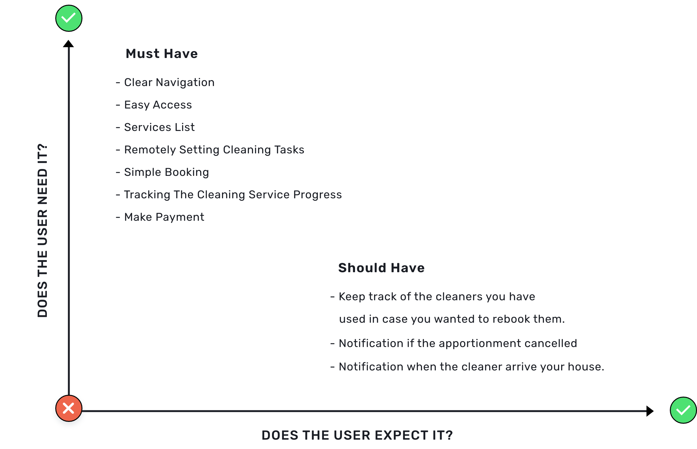
In this step, I organized potential solutions within this matrix then prioritized them while keeping in mind the business needs compared to the users.
After the previous steps, I had a vision in my head of how the app will function. So I mapped out the user flow to understand each step on the path the users will take through the solution. Through the user flow I got the idea of the scope of key screens to be designed in the next phase.

A user flow focused on planning.
Now I will go through from use case to system.

Easy to use;
View from anywhere.

Monitor & Live streaming;
Multi-view;
Motion and face
Automatically detection.

Hands-free wearable device;
Fast learning tool with help of AR;
Information digitally;
Documenting the process.
With IoT products becoming more service-centered, creating a sustainable interaction with the user is a significant challenge for design. I built an ecosystem that connects the cleaning staff, house, and householder in both digital and physical.

My basic idea is through users matched their mobile APP with a smart home system's camera to allow them to view the house situation or cleaning progress anytime and anywhere. Our users are allowed flexible, setting the personalized cleaning tasks based on their needs and sharing the cleaning requests or instructions visually and dynamically to cleaning staff to make their working process more efficient and accurate.
By now, I have already gathered require information to establish the basic structure of how the app works. So I started to begin the design phase.
I started with a low-fidelity paper prototype by sketching the app's core aspects as a simple prototype to helps me to understand the whole structure of the app and to uncovered smaller vulnerabilities and frictions. My main objective was to create an easy flow and a clear way to navigate.
It was difficult for users to imagine an AR screen based on paper-prototypes and the intended interactions thru the paper and tap-only gestures.

The proposed flow for navigation.
Then I designed mid-fidelity wireframes. It helps me to identify usability issues in a new design process. I listed the critical screens needed to be complete the main user tasks:
(1) Access to the smart home camera to view the room;
(2) Setting the personalized cleaning tasks;
(3) Scheduled an appointment with cleaning staff.
After the user test, I realized that user were not quite like landscape mode, so I put that into an option, users could based on their personal preference to make the mode decision.

I created a style guide to maintain consistency and set standards throughout the whole project-taking visual.
Bright green color accents helps to attract users’ attention to interactive zones and active states of the layout elements.I have given a bright look and feel UI for users so they can feel pleasure.

After wireframes, I turned mhy idea into high fidelity screens using Adobe XD, then used Invision to create a clickable prototype to validate my solutions. Mobile screens were polished and finalized, all based on A/B and click tests, and additional adjustments with very helpful peer feedback. The interfaces below represent the outcome of the design ideas and decisions.

I started running this project in a typical way: discover → define → ideation → design, until I developed a thorough design system conception.
One thing I learned is getting feedback as early as possible was very valuable as it heavily influenced my design process.
👀 Thanks for viewing! 😊 I hope you enjoy this project!
